Designing the center of gravity.
The hardest part of platform growth is not adding capabilities. It is helping them behave like one product.
Complexity accumulates.
Products rarely become complicated all at once. They grow into it.
A feature solves one problem. Another responds to a new opportunity. A successful capability expands into its own product. Navigation evolves to make room. New entry points appear. Teams grow. Priorities shift.
Over time, complexity does not arrive as a single decision. It accumulates.
The harder question is not how to add another capability. It is how to help all of them still feel like one product.
Growth creates opportunity. It also creates tension.
FIG. 01 / Growth and complexity
Raise a more fundamental question.
The product was entering a period of expansion. For years, people had relied on it to send and receive money. Now it was growing into something broader.
The ambition was not simply to modernize the interface. It was to reorganize the experience around a more connected ecosystem.
Viewed individually, the new capabilities were reasonable product decisions. Viewed together, they raised a more fundamental question:
What should sit at the center of the experience?
That question quietly influenced almost everything that followed: navigation, Activity, messaging, entry, and product discovery.
The diagram represents an organizing logic, not a shipped hierarchy: a connected system of behaviors, surfaces, and decisions anchored around a center of gravity.
Track. Locate. Act.
One of the clearest examples was Activity.
It was already one of the most heavily used destinations in the app. People returned there to keep track of their money, locate specific transactions, and take action when something required attention.
The redesign challenged the assumption that Activity was simply a ledger. Instead, it became a framework for understanding behavior through three recurring jobs.
- Track
Observational Awareness
Understand context and follow what matters throughout the journey.
- Locate
Spatial Intent
Find what they need, when they need it, reducing cognitive load.
- Act
Decision Resolution
Take action with confidence and clarity, supported by the framework.
That reframing organized the experience around how people actually navigate, find, and act, reducing friction and making the next step easier to understand.
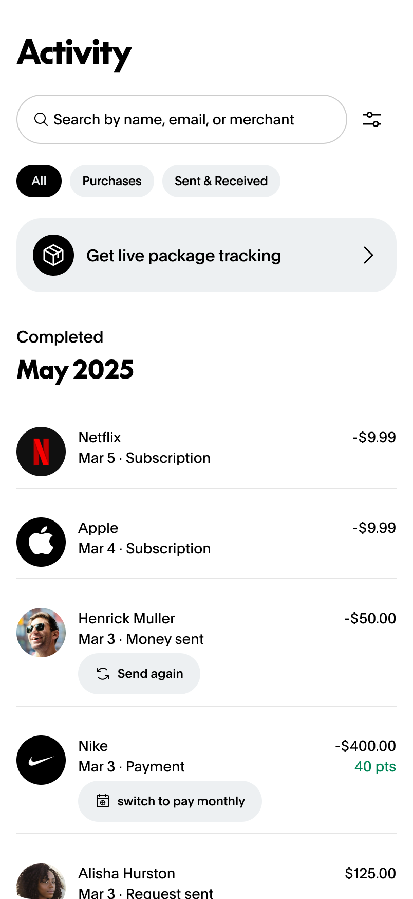
Activity as a behavioral framework — Track, Locate, and Act become visible in the interface through search, contextual information, and actions embedded directly within the activity stream.
One question. Many decisions.
That shift had implications well beyond a single screen. If people came to Activity to understand what had happened and decide what to do next, then navigation, messaging, search, discovery, and supporting actions all needed to reinforce that behavior instead of competing with it.
Simplify as we expand.
Navigation was being simplified even as the ecosystem expanded to accommodate new destinations.
Evolving Messaging.
Messaging evolved alongside a growing content design practice, ensuring a unified voice across services.
Discoverable Utility.
New financial products needed to feel discoverable without overwhelming the app's everyday utility.
Decisions that had previously been debated in isolation could now be evaluated through the same lens. One organizing question connected them.
“Does this help people accomplish what they came here to do?”
FIG. 04 / A singular guiding question aligned every decision, from experience design to prioritization, back to real user intent and value.
Growth becomes coherent through product relationships.
The same thinking extended across the broader engagement.
Navigation was being simplified while the ecosystem expanded. Messaging was evolving alongside a growing content design practice. New financial products needed to feel discoverable without overwhelming everyday utility.
Creating coherence was not about finding a perfect hierarchy. It was about helping many interconnected decisions reinforce one another instead of fragmenting the experience further.
Everyday Utility
Keep core tasks simple and fast, meeting people where they are.
Product Discovery
Surface new capabilities in context, without overwhelming everyday utility.
Shared Framework
A unified design language that connects every surface into one cohesive system.
Across everyday utility, product discovery, and a shared experience framework, the work moved toward a product whose parts behaved less like separate destinations and more like a connected system.
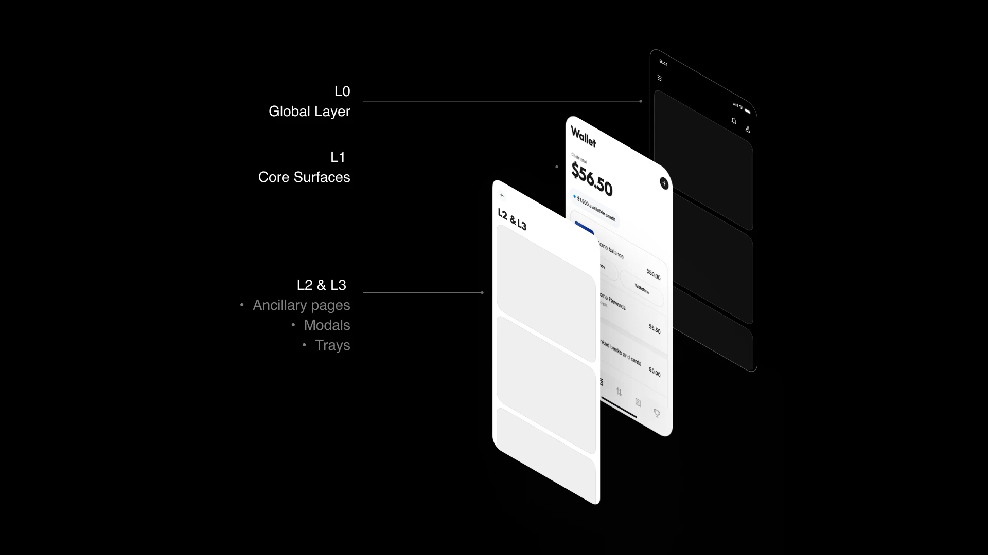
FIG. 05a / Shared experience framework
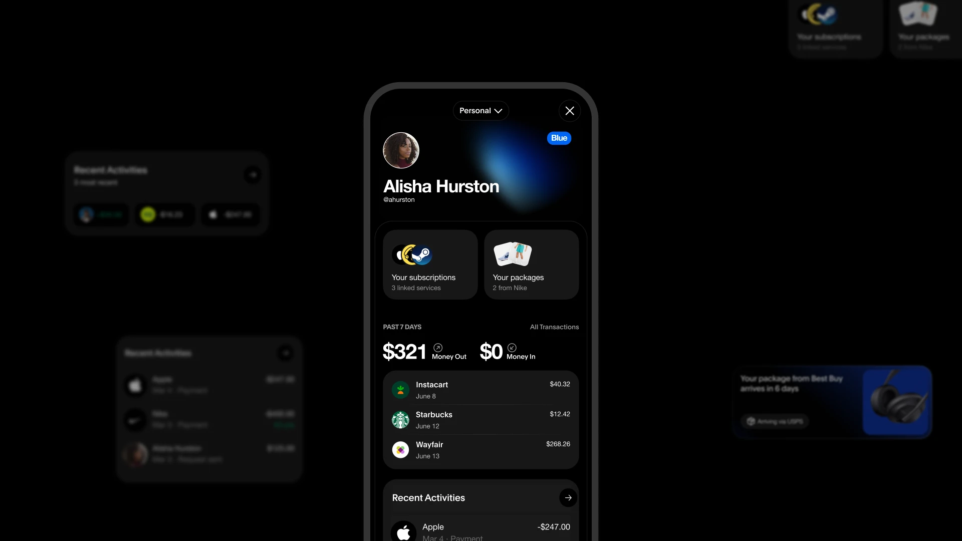
FIG. 05b / Control Center artifact
A coherent platform capable of supporting future growth.
Helping new ideas belong.
Large platforms rarely lose coherence because they grow. They lose coherence because growth changes relationships faster than products change structure.
The hardest part of platform design is not introducing something new. It is helping new ideas belong.
Design can support that work through navigation, content, interaction, and visual systems, but none of those disciplines can create coherence on their own. They can only express it.
That realization continues to shape how I approach growing platforms today: not as collections of features, but as systems of relationships that need a clear center before they can continue to grow.
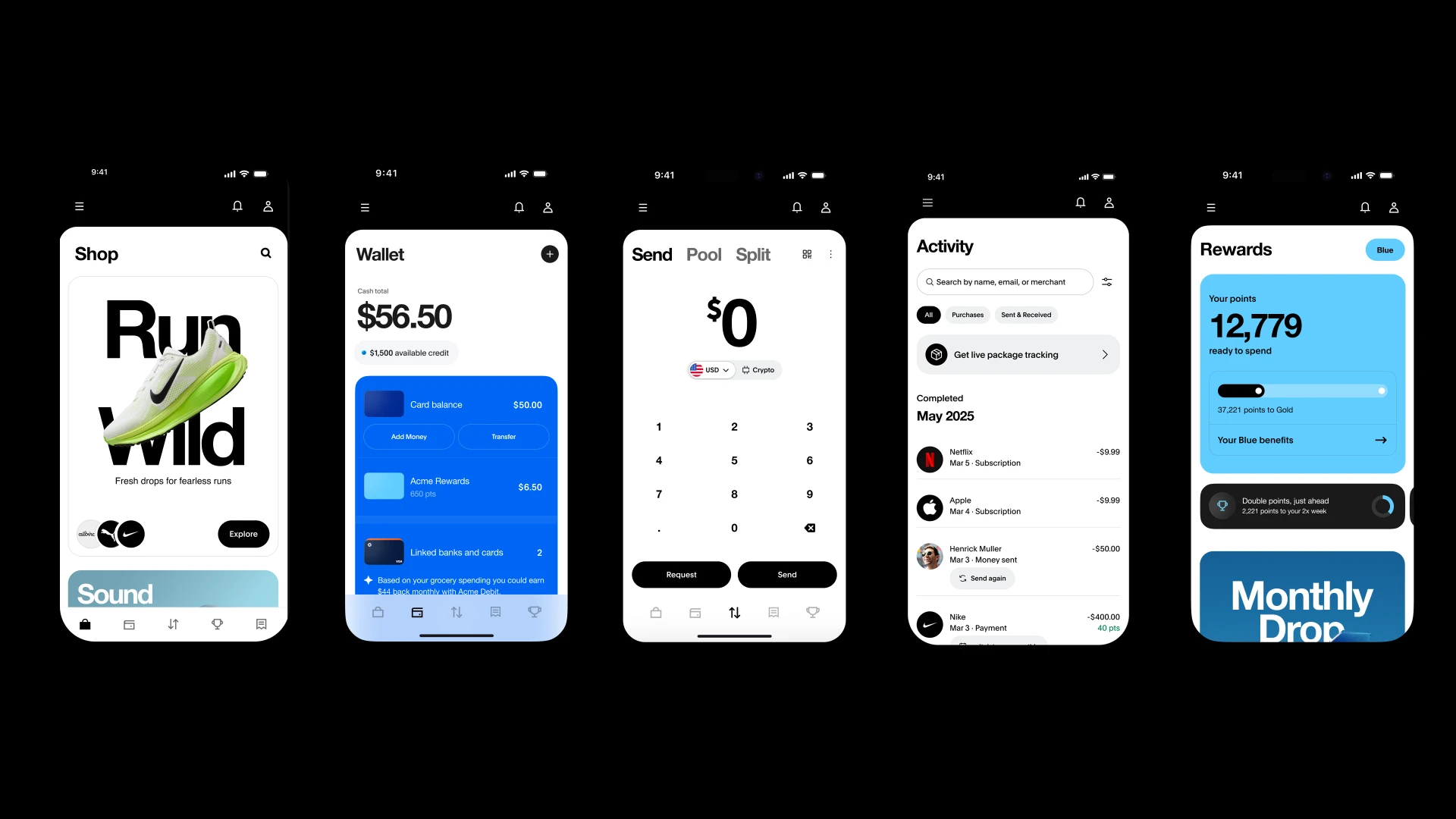
FIG. 06 / End-to-end product coherence